Portfolio
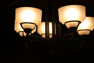
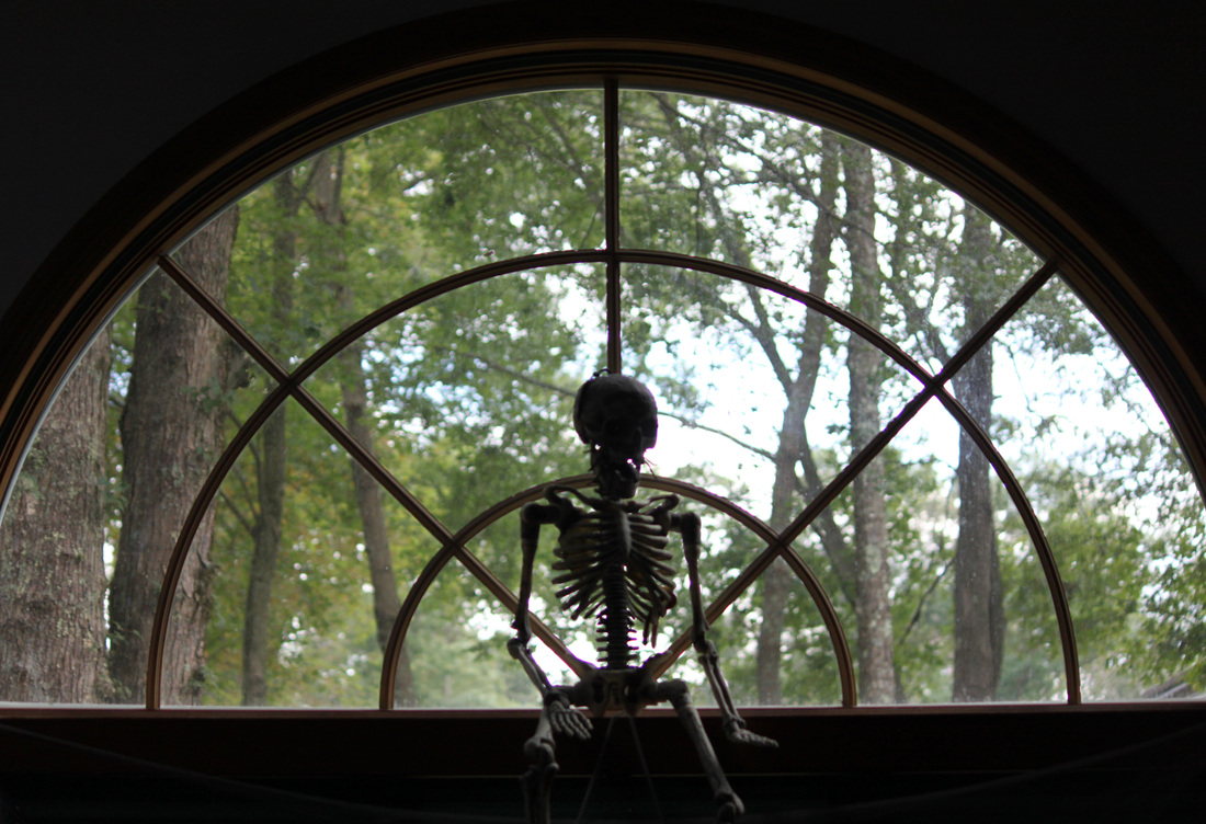
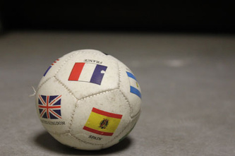
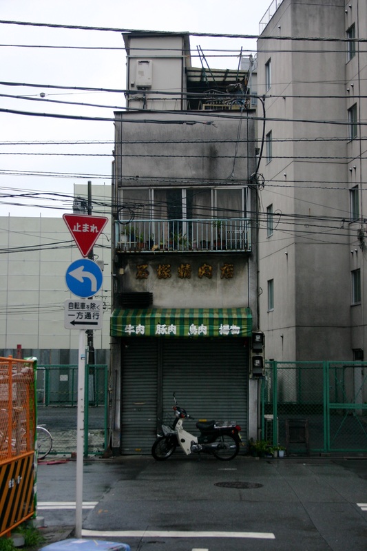
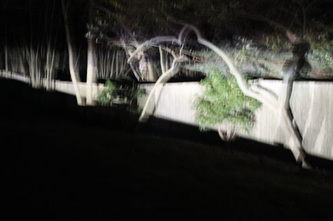
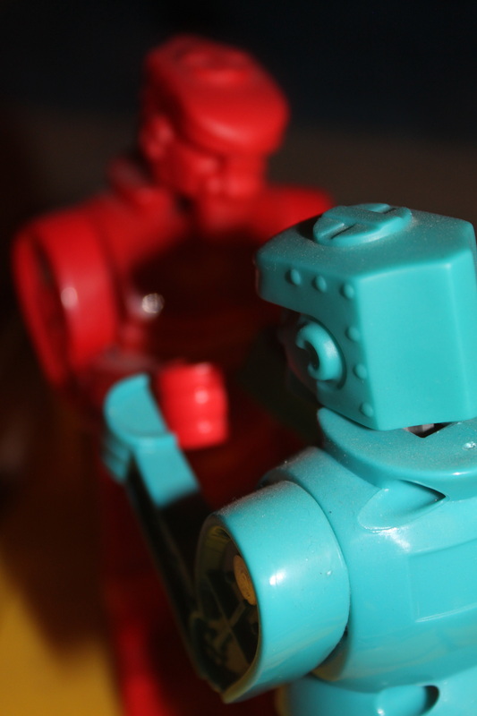
These are my pictures I thought were my best. The first picture, due to the angle and camera settings I used, makes a contrast between the bright lights and dark background (which really wasn't that dark). There is also a contrast between the soft faded line that separates the white and yellow parts of the light and the stiff, absolute lines that separate yellow from black. The second picture is a Halloween decoration I have. The straight lines on the window lead down the skeleton's pine and sync up with the points where his hips jut out. The lower curved line leads to the skull. The background is trees and lines are more bendy and natural, so I guess its like a life/death contrast if you feel like reading stuff into it. Third picture is really simple, it's just a very in focus toy soccer ball with a bunch of national flags laying on a cement floor. The ball isn't a perfect sphere and it has its stitches coming out on the left side, so its a poor excuse for a ball. The fact that its so in focus and the rest of the picture isn't makes you really notice the ball's imperfections. The fourth picture is in Japan, it's a wicked thin building. The picture is divided up into roughly even thirds, with the straight ahead view of the building showing just how unlivable it is. Power lines and gray buildings give an impassion of an impersonal, cold city. The fifth picture is a fence that I shined a car light on from an awkward angle to make it look bendy, triply, and sorta scary. The blurriness of the trees would be none too good in most pictures, but it contributes to the unsettlingness of the tripped out fence. The sixth and final picture is Rock 'em Sock 'em Robots. I think for a picture to be great, you've got to be able to make inferences from it. Using angle, shadows, and depth of field, you can infer that Blue is the heroic Robot and Red is a villain. So, thats a great picture.
